The Design Challenge
In this design challenge, students worked in groups of 4-5. Each team member chose their role on the team such as web developer, graphic designer, social media manager, videographer, digital music producer, or product manager. Students then worked together to create a unified brand that could be displayed on their website. Because each team member was responsible for their own part of the overarching project, this eliminated the possibility of group carry. Additionally, allowing students to brainstorm their own business ideas really energized and motivated students to work hard to succeed.
It wasn't uncommon to hear the web developers pleading with the graphic designers to, "Put the logo in the Dropbox!" Now, if that isn't the real startup experience, I don't know what is.
Student Projects
LAV Cards
First of all, I'd love to highlight the work by one student business, LAV cards, which is a greeting card company that designs environmentally-friendly cards for various occasions. The LAV Card team chose to use animated gifs in some really clever ways on their website. Not only was the logo on their website an animated gif, but the product design mockup was also shown as a 3D animation. This was such a cool way to use what we learned in our first unit on GIFs in this new project.
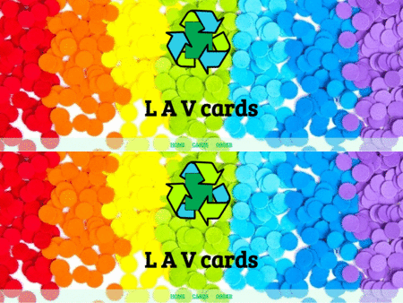
Mikina's amazing work on the website
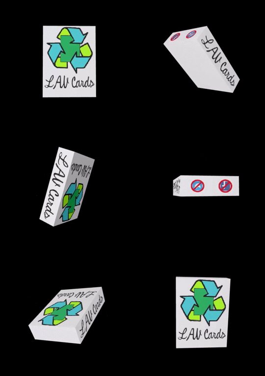
3D modeled packaging by Balazs
Dear Deer
Deer Dear is a custom t-shirt company that creates unique tye-dye t-shirts featuring truly hilarious puns. This team had a really cohesive brand with an active Facebook account featuring a variety of promotional videos. I was very impressed with this team's contagious creativity, as well as their wearable and stylish t-shirts. Check out their designs below: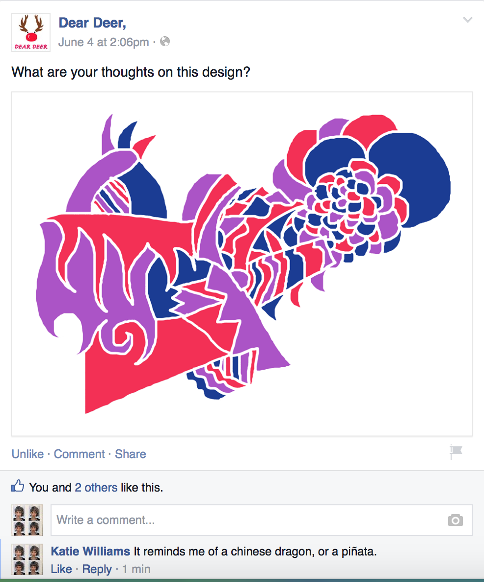
The Deer Dear team used Facebook as a way to get feedback from their customers on new design ideas
The Prank Maker
The Prank Maker is an agency that organizes pranks and flash mobs at the International School of Amsterdam. Rika did a fantastic job coding this agency's website. The team page is especially current and hip. For the team page, Rika created animated GIFs to showcase the team's members in a quirky way.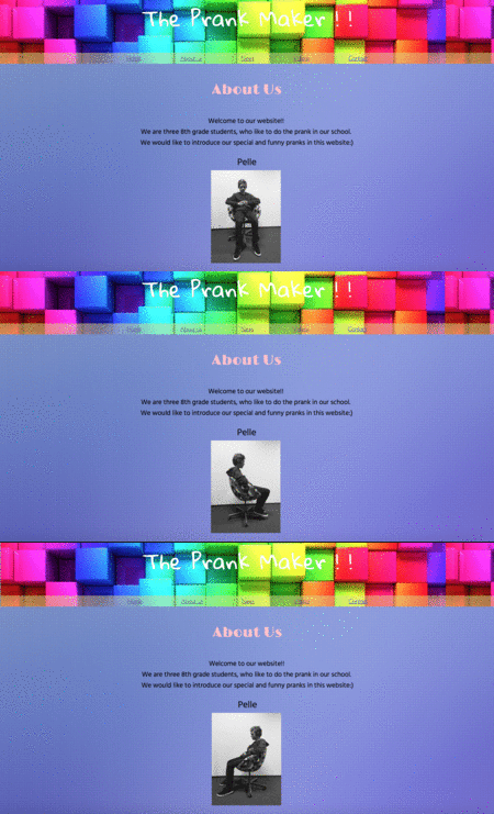
Rika's Team Page is killer
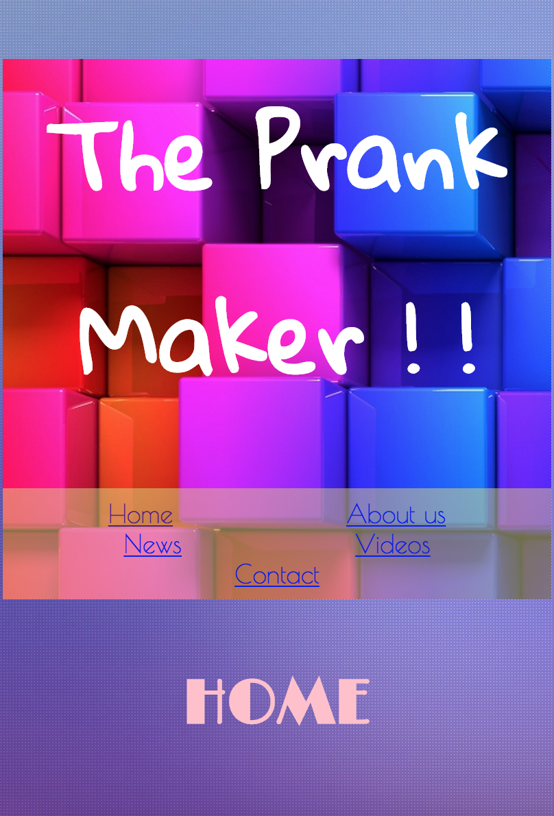
The website is also responsive
Akalah Loke
Akalah Loke is a non-profit founded to support an ISA teacher recently diagnosed with breast cancer. Akalah Loke means "pink flower" in Hawaiian, which is where this teacher called home. The Akalah Loke team created and sold pink flower headbands in order to raise awareness for breast cancer.
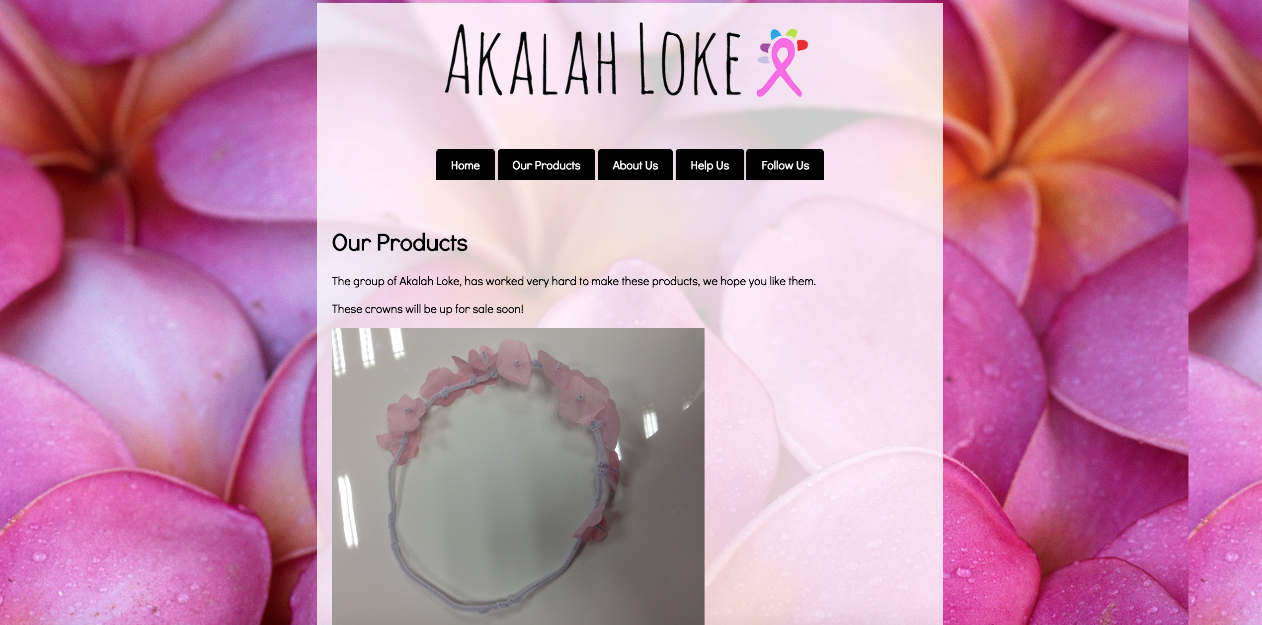
Victorine designed a really sleek website for the non-profit
Stick-It
Stick-It is a sticker company that designs hip circular stickers in a variety of styles. This team generated the most revenue from their business model by selling sticker packs to students. It wasn't uncommon to see Stick-It stickers on student laptops from our 1:1 program, or on agendas and folders. They were a real hit.
As you can see, the website was well-organized and equally stylish. Great work by the web developer and graphic designer, Alex!
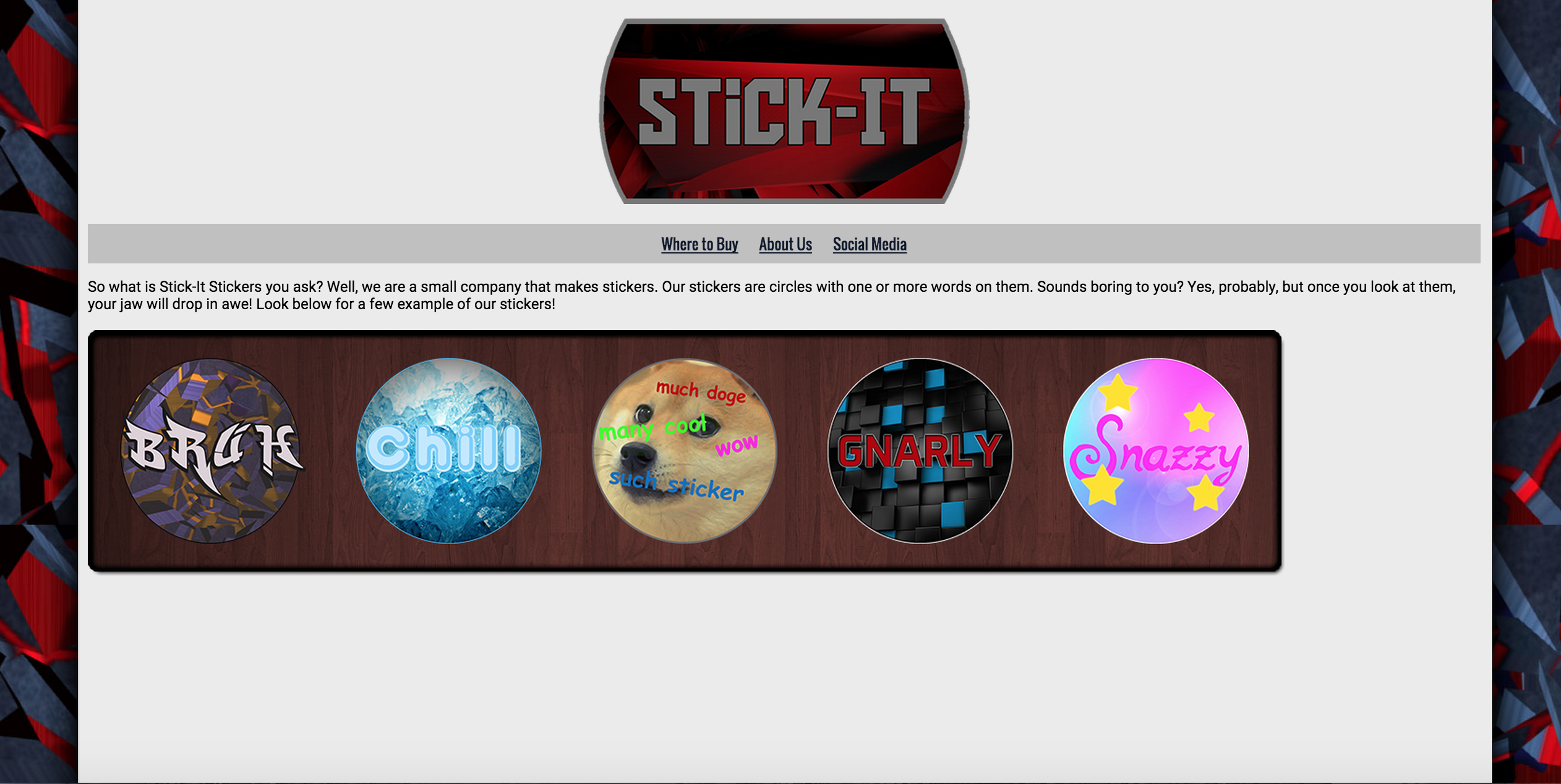
A really well designed layout by the Alex
Artificial Chaos
Artificial Chaos is a musical group that creates EDM style music. The Artificial Chaos team worked incredibly well together to create a very cohesive brand. Their digital assets included an album cover, digital song, website, t-shirts and promo posters.
Check out RJ's amazing EDM song below and feel free to leave him some comments:
The Pizza Box Company
The Pizza Box Company is a business that specializes in creating custom pizza boxes for a variety of occasions. The Pizza Box Company's team created custom pizzas, product packaging, social media pages, a website and a promotional video.

Valentina was super self-directed with this project and taught herself to code this website using Codecademy
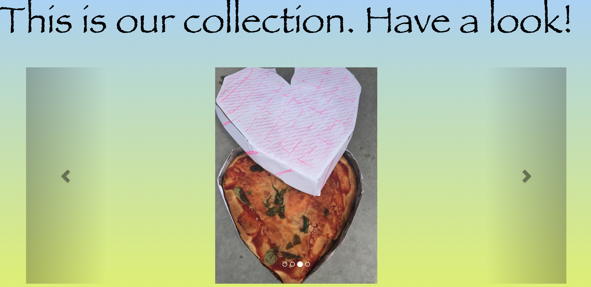
This team also actually baked custom pizzas
Secret Scents
Secret Scents is a specialty company that manufactures scented sachets to perfume one's interior spaces. The Secret Scents brand maintained a variety of very active social media channels, in addition to creating custom product packaging. Check out this stunning GIF, which is featured on the Secret Scents homepage.
What an epic GIF by Chris
Kotton graphics
Kotton Graphics is a t-shirt design company that creates custom t-shirts upon request. Gabi worked really hard as the team's web developer to teach herself front-end web development using the General Assembly Dash program. Check out their cool color scheme on the site below:
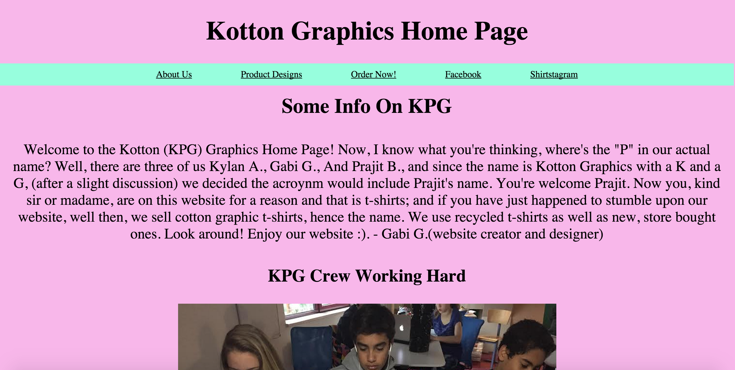
Great job on the website, Gabi!
Tibsey Training
Tibsey Training is a dog-training company that raises money and awareness for local shelters. The Tibsey Training team created an array of digital promotional materials for their company. However, I was the most impressed with their website, which was one of the only responsive site in the entire grade level.
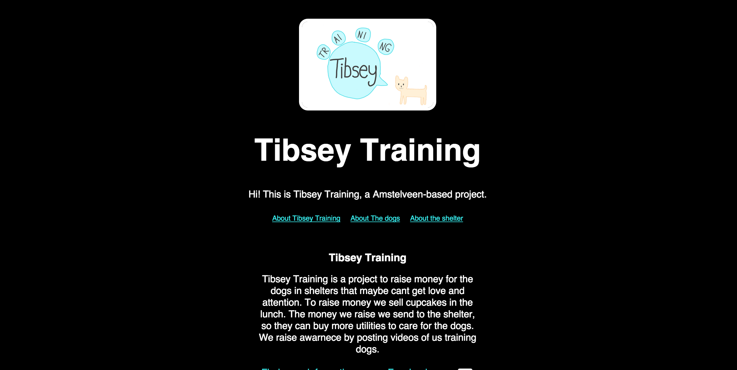
Kudos to Brooke for this responsive website
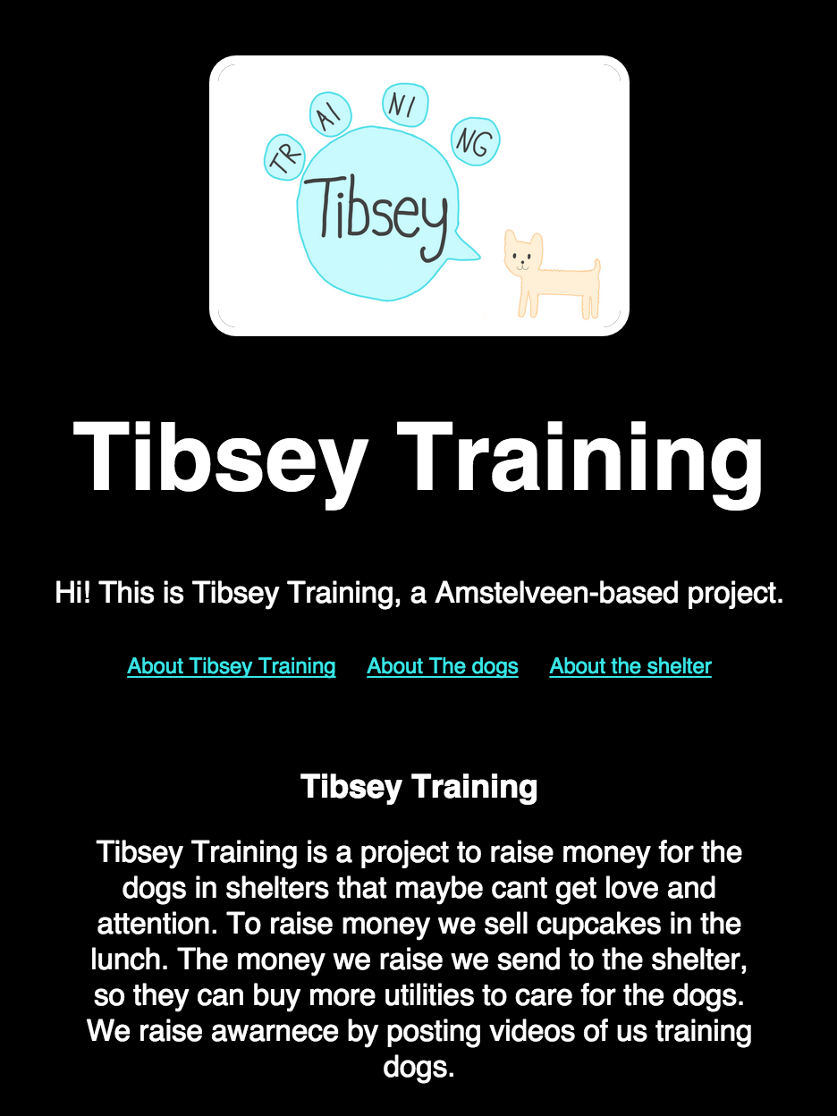
As you can see, it looks great on mobile, too!
Don't Wrong the Dugong
Many of you may not know what exactly a dugong is and that's exactly the slant this team took on their branding, as a non-profit dedicated to raising awareness about this endangered animal. This team really thought outside of the box and decided to create a to-scale dugong to place in the school. Check out their massive poster below:
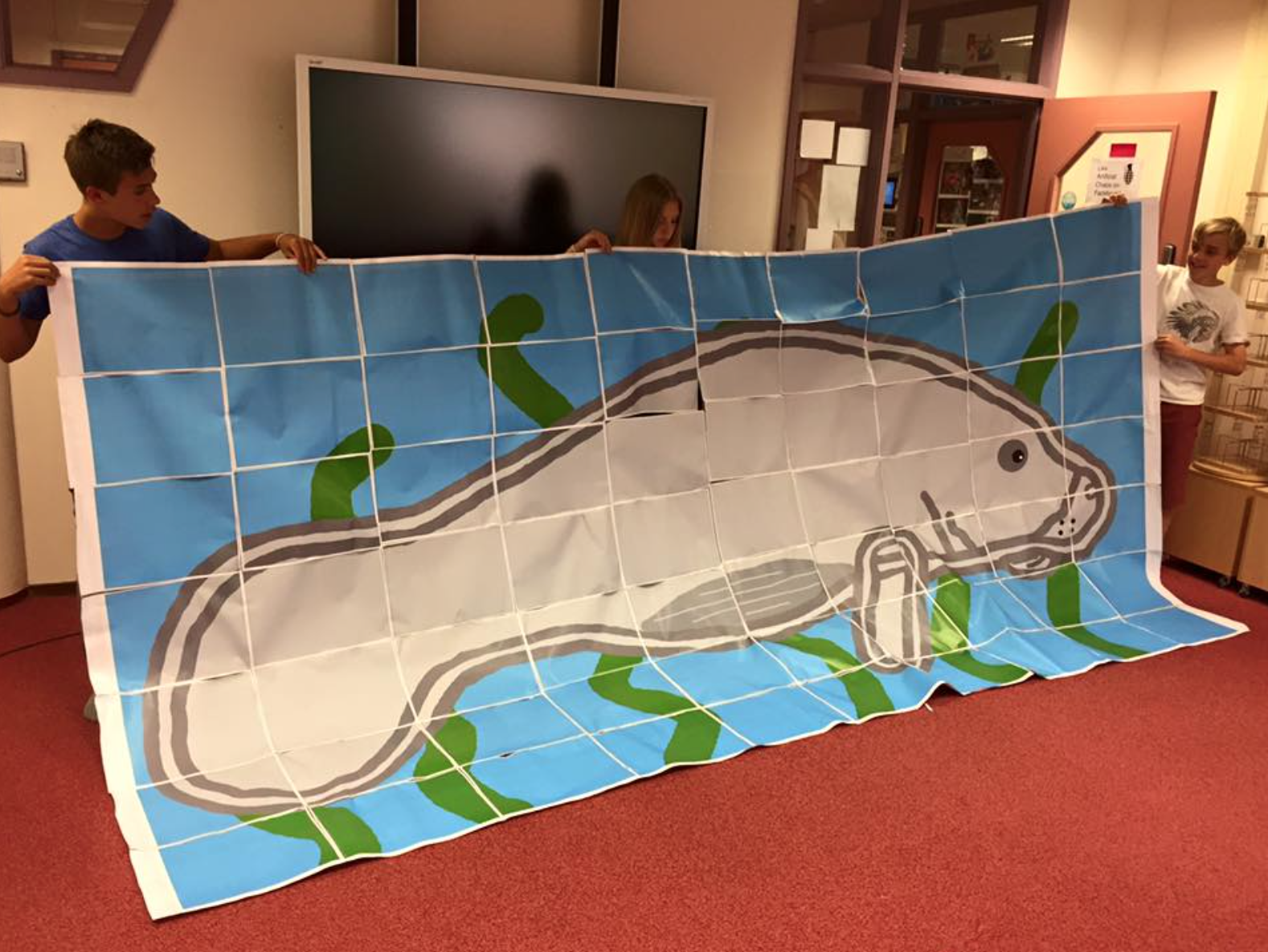
Turns out a dugong is an Australian manatee
How to organize students as startups
Brainstorming
As you can see, the projects from this design challenge were incredibly diverse. We had everything from perfume companies to dog training agencies---what a great unit! If you're wondering how they came up with these awesome ideas, I urge you to check out my post on conducting effective brainstorming sessions. In our brainstorming session, student teams came up with at least 50 ideas per team. We didn't judge the ideas, but rather praised really off-the-wall ideas and out-of-the-box thinking. If you're interested in doing a similar project in your classroom, I highly encourage you to let students choose the topic for their company through a brainstorming process.
The teacher as a mentor
I'm really a huge fan of Dr. Sugata Mitra's work on the topic of self-directed learning and I formed this design challenge in that spirit. For this project I really didn't offer many lectures. Most of my presentation time was spent showing students how to format their design documentation, which is required by the IB program. Otherwise, you would typically find me floating from team to team offering ideas and support. I created the open space laden with high expectations. I then continuously coached students and offered, "What if" questions to them when they were stuck. I also brought in a professional web developer near the end of the project to answer any lingering questions that the web development students had after completing Codecademy and GA Dash programs. In fact, I spent far less time showing these students how to code or debug and much more time helping them to get started and stay focused and motivated on these programs.
Teamwork
It's equally important to ensure that each student has an independent role within the team. Most teams had at least a web developer, social media manager and graphic designer. Other teams also had product managers and some even included videographers and digital music producers. This not only made grading more fair and efficient, but it also made the day to day operations run more smoothly. Each student knew which part of the puzzle they were responsible for and I was proud to see the students holding each other accountable for their part of the project, as well as offering each other support. It wasn't uncommon to hear the web developers pleading with the graphic designers to, "Put the logo in the Dropbox!" Now, if that isn't the real startup experience, I don't know what is.
It wasn't uncommon to hear the web developers pleading with the graphic designers to, "Put the logo in the Dropbox!" Now, if that isn't the real startup experience, I don't know what is.
Let us know what you think!
We'd love to hear your comments and feedback on this unit. Also, if you're a teacher or workshop facilitator who is thinking about doing a unit in which students create their own startups, feel free to ask any questions below!